Cart Tab IconRive Animated Icon
Tap to select. The cart rolls back, zooms forward on spinning wheels and skids to a stop.
Get the file
This one comes with the Rive Icon Pack: all 30 icons, the .riv and the .rev of each.
The whole set
.rev + .rivAll 30 files in one zip. Open the .rev in the Rive editor and change anything, or use the .riv as it is.
$49.99
Using this file
The licence →Can I use it in a commercial product or a client project?
Yes. Use it in your own apps, websites and games, and in work you do for clients, paid or not. Change it as much as you like. Read the full licence
Can I resell or share the file?
No. Please don't resell, redistribute or re-upload the files, as they are or changed, and don't bundle them into templates, asset packs or UI kits, free or paid. If someone wants one, share a link to this page instead. Read the full licence
Do I need to credit you?
No, credit isn't required. A mention or a link back is always appreciated, though. Read the full licence
What's the difference between the .riv and the .rev?
The .riv is the runtime file: it goes into your app or website and plays there. The .rev is the editable source: you open it in the Rive editor to change the design, the animation or the state machine, then export your own .riv. Read the full licence
I own a course. Do I get it?
Yes. If you own the Rive Masterclass or the Rive Scripting Course, this file and the whole Rive Icon Pack are yours, along with every other file in the library. Sign in with the email you bought the course with and the downloads unlock. Read the full licence
Who owns the files?
The files stay © Tom Acco / Rive Masterclass. When you download or buy one, you get a licence to use it, not ownership of it. Read the full licence
Use it on your site
import { useRive } from '@rive-app/react-canvas';

export function TabCart() {
  const { rive, RiveComponent } = useRive({
    src: '/tab-cart.riv',
    artboard: 'Tab Cart',
    stateMachines: 'State Machine',
    autoplay: true,
    autoBind: true,
  });

  // every input on this page is a view model property
  const vm = rive?.viewModelInstance;
  if (vm) vm.color('color').value = 0xFF6FC057;

  return <RiveComponent style={{ width: '100%', height: 400 }} />;
}
Inputs: selected, color, offColor. All on the TabCart view model.
How it's built
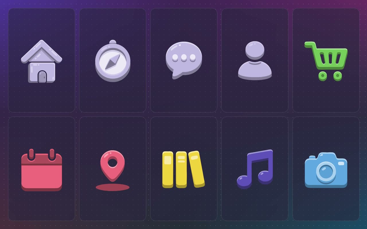
Part of the Tab Bar Icon Set: ten juicy 3D tab icons. Set selected from your app's tab state and the icon turns from grey to its colour and plays its own little animation; turning it off settles it back to grey. Both colours come from data and the shading follows them.
- 1One switchselected is a boolean on the view model. Set it from your app's tab state, or let a tap flip it.
- 2Grey to colourThe colour swaps at the bottom of the squash, so you never see a muddy blend between grey and colour.
- 3The shading follows the colourEvery shaded tone is the bound colour with a light or dark layer on top, so any colour keeps the 3D look.
- 4It lands where it startedThe last frame of the animation matches the resting pose, so it never jumps when it settles.