Rive Layouts and the New Stack: Making the Duolingo Button Responsive
A few weeks ago I built Duolingo's 3D button in Rive. It looked right, it pressed right, and the color and text came from data. Then I wanted to use it in a real app, and it fell apart in the first ten seconds.
The problem was simple. In the editor, I decide how big the button is. In an app, the screen decides.
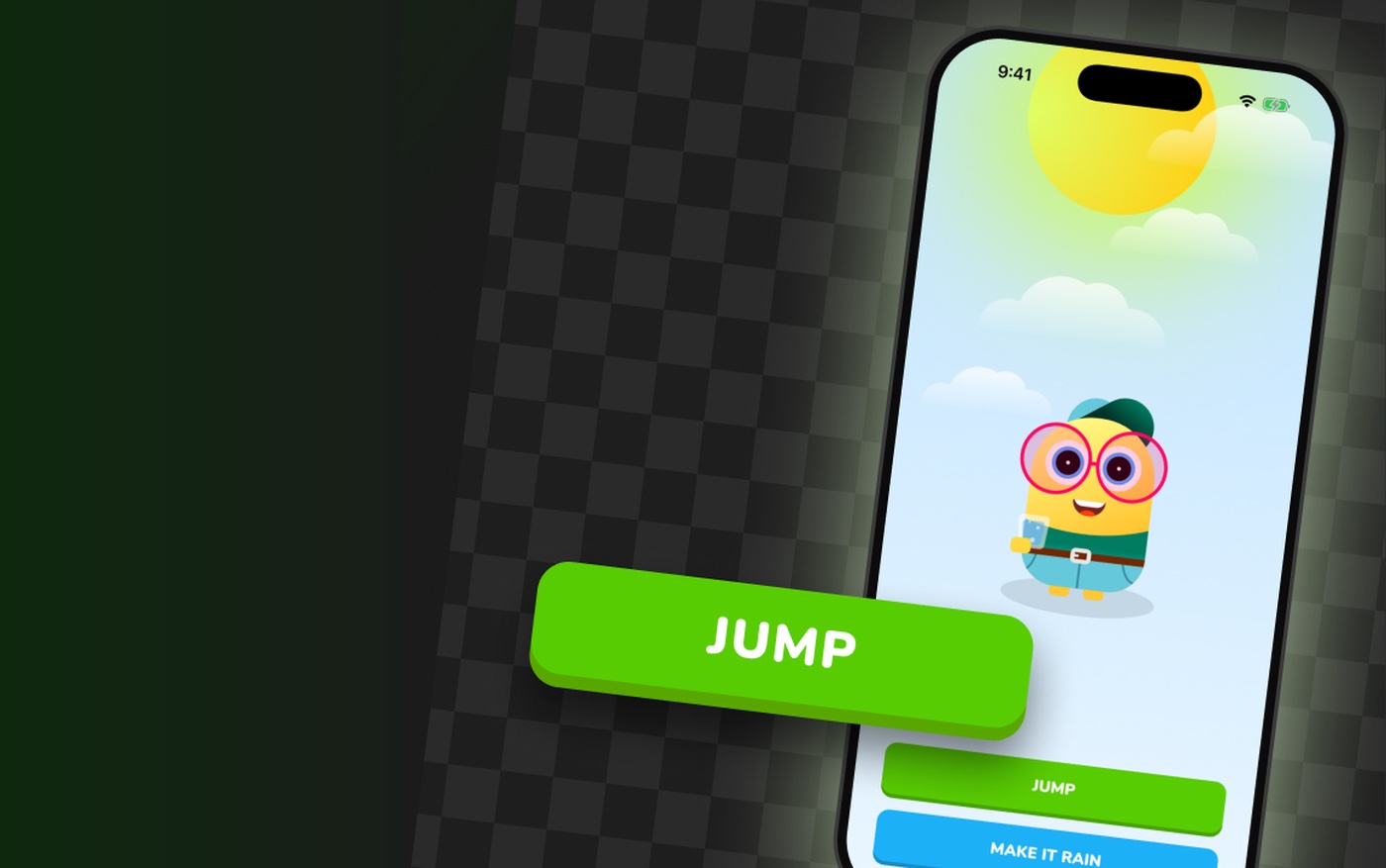
So I rebuilt it as a component, and dropped two copies into a small Flutter app on the iPhone simulator. Same button, different text and color, both as wide as the screen. Press JUMP and the avatar jumps. Press MAKE IT RAIN and the whole scene turns rainy.
This post is about what changed between those two versions. Not much, as it turns out, but every change has a reason.
A drawing, not a component
Here is the original button. Select the Artboard, drag its edge, and watch what happens.
Nothing. The Artboard grows and the button stays exactly where it was.
That's not a bug. A group and a shape have a fixed size and a fixed position. They have no idea that the space around them changed, because nothing told them they should care.
That's what Layouts are for. A Layout is a container that decides the size and position of what's inside it, based on the space it gets. And that space can come from the app, at runtime.
The one idea
Nothing inside a responsive component can depend on a fixed number.
Every piece of this rebuild is that sentence applied somewhere: to the structure, to the depth, to the press, and to the way the button talks to the app.
Why Stack
Layouts in Rive used to mean Rows and Columns. Things side by side, or things one under the other. That works great for a list or a menu, but look at a button. The label sits on the face. The face sits on the base. Nothing here is next to anything. Everything is on top of something.
Before Stack, the way to get that was Absolute positioning: take the label out of the flow and drag it to where you want it. It works, but an absolute element is exactly the fixed number we're trying to get rid of.
Stack is the new layout type Rive released, and it does exactly what a button needs: children sit on top of each other, and they still follow the layout.
You can see the difference the moment you wrap the face and the label in a Layout. The default is a Column, so the label lands under the face. Switch it to Stack, and the label goes right back onto the face.
So the structure of the new button is two Stacks. The Artboard itself is a Stack, centered. Inside it, a second Stack for the face and the label, and the base underneath.
One thing that confused me at first: I set the Artboard to Stack, resized it, and again nothing happened. That's because a Layout only controls children that are Layouts too. Groups can't be. So the groups had to go, and every shape ended up in a Layout of its own. And yes, deleting the Face group also deleted the press animation, because the animation was keyed on that group. We'll get it back in a much better way.
Hug or Fill
This is the setting that does the actual work.
Every Layout has a size mode for its width and its height. Hug means "be as big as what's inside me". Fill means "be as big as the space my parent gives me".
A component that should follow the screen is Fill all the way down. The face Stack fills the Artboard. The Shape Layout around the face rectangle fills the Stack. If one of them is still on Hug, it holds on to its original 240 by 40, and the chain breaks right there.
The label follows the same logic. In the first tutorial I squeezed it to 85% to look more like Duolingo's font. A squeeze is a fixed number, so it went back to 100%, centered vertically, and set to Auto Height so it always takes the width of the button.
The depth is a margin now
The 3D look of this button has always been one thing: the face sits 4 pixels above the base. In the first version, that was a position. The face was simply drawn 4 pixels higher.
Rive Masterclass + Rive Scripting
Master Rive for real products.
Get Both for $219Both courses for $219. Save $49.
Rive Masterclass + Rive Scripting
Master Rive for real products.
Both courses for $219. Save $49.
In a Layout, position isn't yours to set anymore. The parent decides. What you control is the margin: the space between a Layout and the edges of its parent.
So the face Stack fills the button, with 4 pixels of margin at the bottom. The base fills the button too, with 4 pixels of margin at the top, so it never peeks out above the face. Between them, the same 4 pixel edge as before. Except now it stays 4 pixels at any size.
The press is a margin too
This is the part I like most, because it's the same idea one more time.
The original press moved the face down 4 pixels. That's a position, and positions break when the button changes size. But we already know where the face is: it's the Stack with 4 pixels at the bottom.
So the press doesn't move anything. It moves the margin. In Default, the face has 4 pixels at the bottom and 0 at the top. In Pressed, 0 at the bottom and 4 at the top. Same two states, same transition from the first tutorial, just keyed on different properties.
And because the animation never knows how big the button is, it presses the same on a small button and on one that's as wide as the screen. That's what makes it a component and not a picture of one.
A state, or an event?
A button in a real app has one more job: telling the app it was pressed.
The View Model already had isPressed, a Boolean from the first tutorial. It's tempting to just read that. But isPressed is a state. It says whether the button is down right now, and it stays true for as long as you hold it.
The app doesn't want a state. It wants an event: the button was just pressed. That's what a Trigger is.
So the View Model got a Trigger called pressed, and the Pressed state fires it with a ViewModel Change action. Hold the button for three seconds and isPressed is true for three seconds, but pressed fires exactly once, at the moment you press.
In the app
On the code side, two things matter.
The first is the fit. To let the app decide the button's size, the button is rendered with Fit Layout. The Artboard takes the size of the widget around it, and the Layouts inside do the rest. In Flutter:
final vm = file.viewModelByName('ButtonViewModel')!.createDefaultInstance()!;
final controller = RiveWidgetController(
  file,
  artboardSelector: const ArtboardNamed('DuoButtonResponsive'),
)..dataBind(BindByInstance(vm));

vm.string('buttonLabel')!.value = 'JUMP';
vm.color('buttonColor')!.value = const Color(0xFF58CC02);
vm.trigger('pressed')!.addListener((_) => jump());

SizedBox(height: 56, child: RiveWidget(controller: controller, fit: Fit.layout));
The second is the instance. Both buttons come from the same Artboard, but each one gets its own View Model instance. That's why each has its own text, its own color, and its own pressed. JUMP's Trigger makes the avatar jump. MAKE IT RAIN's Trigger changes the weather, which lives in a completely separate Rive file.
That separation is the point. The button doesn't know there's an avatar. It only knows it was pressed, and the app decides what that means.
What is next
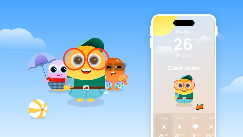
This was responsiveness on one small element. A whole screen is the same idea at a bigger scale: components inside components, Rows and Columns and Stacks, data moving between them. That's what we build in the Rive Masterclass, where the weather app and the characters in this demo come from, and where the whole thing adapts to any screen.
If you haven't built the button itself yet, that's the first tutorial:
The starter file for this one, with a short Flutter example of the finished button:
Download the Responsive Duolingo Button Starter
The starter file from the tutorial: the Duolingo button from part one, before any Layouts. Open it in Rive and make it responsive along with the video. Includes a short Flutter example of the finished button in an app.
Get more Rive tips
Weekly tutorials, new lessons, and Rive community highlights — no spam.