Eye Toggle
UI ElementsData BindingIn a set
Show or hide a password. The lashes squeeze shut, then the eye opens wide.
Get the file
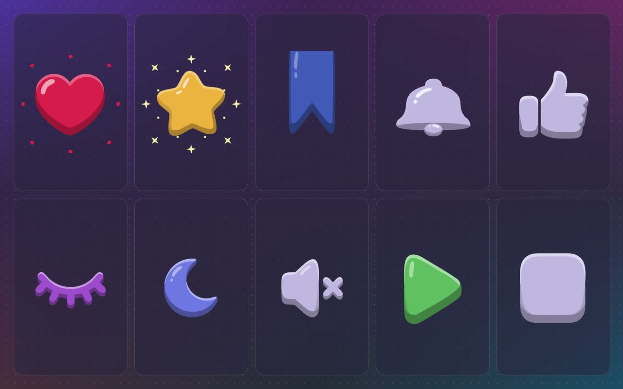
This one comes with the Toggle Icon Set: all 10 icons, the .riv and the .rev of each.
The whole set
.rev + .rivAll 10 files in one zip. Open the .rev in the Rive editor and change anything, or use the .riv as it is.
$29.99
Use it on your site
import { useRive } from '@rive-app/react-canvas';

export function ToggleEye() {
  const { rive, RiveComponent } = useRive({
    src: '/toggle-eye.riv',
    artboard: 'Toggle Eye',
    stateMachines: 'State Machine',
    autoplay: true,
    autoBind: true,
  });

  // every input on this page is a view model property
  const vm = rive?.viewModelInstance;
  if (vm) vm.color('onColor').value = 0xFFA25AD0;

  return <RiveComponent style={{ width: '100%', height: 400 }} />;
}
Inputs: on, onColor, offColor, outline. All on the ToggleEye view model.
How it's built
Part of the Toggle Icon Set: ten juicy 3D icons, each with one switch. Bind on to your app's state and the icon plays its animation whenever it changes. Both colours come from data, and outline swaps the off state for a clean outline.
- 1One switchon is a boolean on the view model. Set it from your app, or let a tap flip it.
- 2The shading follows any colourEvery shaded tone is the bound colour with a light or dark layer on top, so any on or off colour keeps the 3D look.
- 3The swap hides in the squashThe icon changes at the bottom of the squash, so you never see the two states on top of each other.
- 4Outline when offoutline swaps the off state for a clean outline drawn from the same icon.