Why Rive Animations Look Different on Real Devices
Why Rive Animations Look Different on Real Devices
When I first started shipping Rive animations to production, something kept happening that I couldn't explain.
The animation would feel cramped. Or touch interactions felt clumsy. Or a font would silently fall back and break the layout.
But the more I worked with Rive in production apps, the more I realized this gap is just part of the workflow — unless you plan for it.
The Editor Is Not the Runtime
Rive's editor is an incredible design environment. But it's still a controlled one.
In a real application, animations don't live in isolation anymore. They're affected by:
- Real screen sizes and aspect ratios
- Runtime layout and fit decisions
- Touch input instead of mouse
- Dynamic data
- App lifecycle and performance constraints
The moment an animation leaves the editor and enters a real app, it needs to work with a completely different set of constraints.
That's where most surprises happen.
Fit Is a Runtime Decision
One of the most common issues is Fit.
In the editor, everything looks correct because the artboard size is fixed and the viewport is predictable.
But in a real app, the device needs to decide:
- Should this animation scale?
- Should it fill, contain, or fit height?
- Should it respect layout constraints?
- What happens on tall phones vs small ones?
Very often, the designer assumes one fit mode and the developer assumes another. Neither is wrong — they just never talked about it.
An animation that feels perfectly framed in the editor can crop unexpectedly, feel too small, or stretch in ways you never intended.
And you only see it on the device.
Responsiveness Is More Than Scaling
On mobile, responsiveness isn't just about scaling an artboard. It's about:
- Layout adapting to different screen sizes
- Content reflowing based on available space
- Constraints behaving under pressure
Text might grow. Containers might shrink. Safe areas suddenly matter. An animation that feels balanced in the editor can feel completely off in a real layout.
Touch Is Not Mouse
Another shift happens with input. Most animations are designed and tested with a mouse: hover states, precise clicks, smooth drag gestures.
On mobile:
- There is no hover
- Touch is imprecise
- Interactions are discrete and intentional
Rive Masterclass + Rive Scripting
Master Rive for real products.
Get Both for $197Both courses for $197. Save $50.
Rive Masterclass + Rive Scripting
Master Rive for real products.
Both courses for $197. Save $50.
Small timing and easing decisions suddenly matter much more. What felt playful with a mouse can feel broken with a finger.
Assets Break More Often Than You Expect
Another common source of surprises is assets.
In the editor, fonts are available, images load instantly, everything just works.
In a real app:
- Fonts might not be embedded
- Images might not be packaged correctly
- External assets can fail silently
Suddenly text just disappears, spacing breaks, layouts shift. Nothing warns you ahead of time. You only find out when you run the app.
When Data Enters the Picture
Once animations become data-driven, the gap grows wider.
- Numbers update dynamically
- Text length changes
- States switch based on real values
- Animations stop being predictable loops
What looked stable in the editor can overflow, snap instead of ease, or transition at the wrong moment when real data comes in.
The Moment I Realized the Problem
After running into these issues again and again, I noticed a pattern. The editor is not where problems surface. They surface at integration — when:
- Code is already integrated
- Fixes are expensive
- Animation changes require back-and-forth between designer and developer
I needed a way to see the truth earlier.
How I Solved It
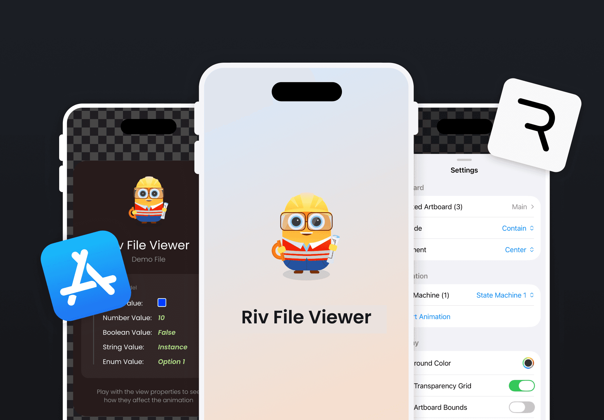
Instead of guessing how a Rive file would behave at runtime, I built a small app to test it directly on device: Riv File Viewer.
You can:
- Load real .riv files from URL or local storage
- Switch artboards and state machines
- Test different fit modes instantly
- Trigger inputs with real touch
- Debug in the console
No Xcode needed. Just drop your file and see how it actually runs. It doesn't replace the editor. It complements it.
Catching Problems Before They Ship
Since adopting this workflow:
- Fit issues surface early
- Layout problems are obvious before integration
- Asset and font issues don't surprise me anymore
- Data-driven edge cases are easier to debug
Most importantly, animations behave more intentionally in production.
Final Thought
Rive animations don't really exist until they run on a real device. The editor is where you design intent. The device is where that intent gets tested.
Riv File Viewer is free on the App Store.
Get more Rive tips
Weekly tutorials, new lessons, and Rive community highlights — no spam.