How to Build an Interactive Toggle Button in Rive (Day / Night Mode)
How to Build an Interactive Toggle Button in Rive (Day / Night Mode)
Interactive UI elements are a big part of what makes modern products feel alive.
I wanted to walk through the thinking and structure behind building a Day / Night toggle button in Rive — from visual design, through animation, to full interactivity.
A toggle button might look simple. But it actually combines several core Rive concepts into one small component.
What Makes a Toggle Button a Great Rive Exercise
Here's what we're actually working with inside this one little component:
- Visual design and layout
- State Machines and transitions
- Animation timing and easing
- User interaction and logic
- Communication between components
Because of that, it's a perfect example for understanding how static designs turn into interactive systems in Rive.
Step 1: Design the Toggle
We start by designing the toggle itself using basic shapes in Rive's Design Mode:
- A rounded container that holds the toggle
- A movable knob that slides from left to right
- Text labels for the two states: Day and Night
At this stage, everything is purely visual. No animation, no logic. Just a clean, readable UI that works at a glance.
One small but important decision here: grouping. The toggle knob is placed inside a group so it can be animated cleanly later.
Step 2: Define States with a State Machine
Once the design is ready, we move into Animate Mode and define two states:
- Day (the default)
- Night
Each state describes how the toggle should look at rest:
- Where the knob is positioned
- Which label is highlighted
- Which visual elements are active
Here's the key: instead of animating inside the states themselves, we only define the end values. Each state is a snapshot — not an animation.
This keeps everything clean and predictable. The animation happens somewhere else.
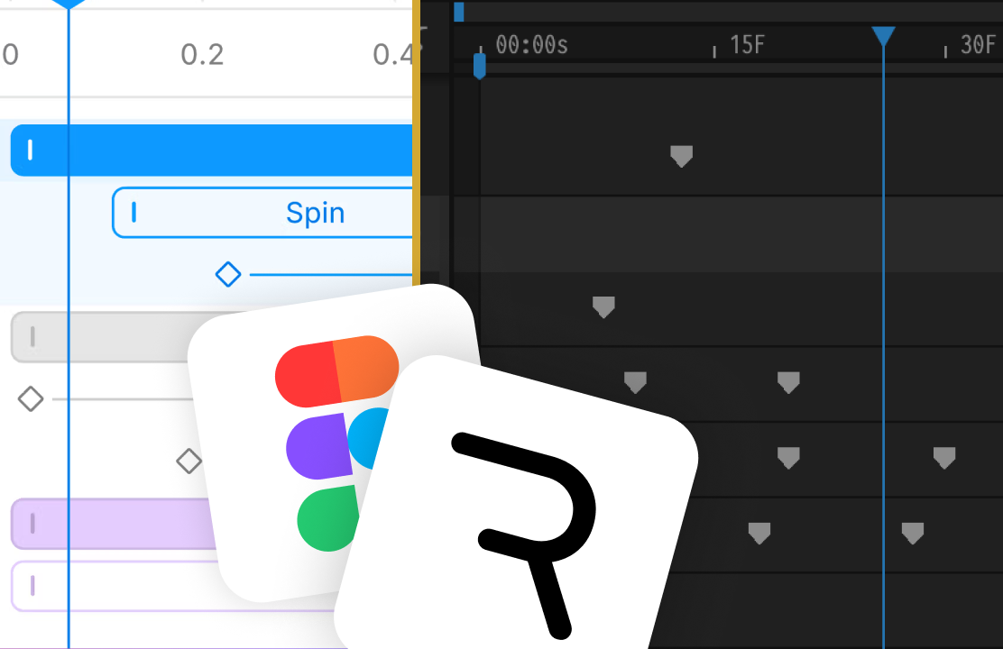
Step 3: Animate the Transition
This is where the real magic happens.
The animation doesn't live inside the states. It lives on the transition between them.
Rather than snapping instantly from Day to Night, we add a transition duration and apply Cubic easing. This creates a smooth, satisfying slide.
This is one of those Rive concepts that changed how I think about interactive animation:
The animation lives on the transition, not inside the states.
Once I understood this, building complex interactions became a lot more manageable. You define what things look like at rest, and let the transitions handle the movement.
Step 4: Add Logic with a Boolean Input
To control which state is active, we introduce a Boolean Input called isNight:
Rive Masterclass + Rive Scripting
Master Rive for real products.
Get Both for $197Both courses for $197. Save $50.
Rive Masterclass + Rive Scripting
Master Rive for real products.
Both courses for $197. Save $50.
false= Daytrue= Night
The State Machine uses this input to decide which state should be active. Simple.
But what makes this powerful is that this input can be controlled from anywhere — from user interaction, from external code, or from other components in the file.
Step 5: Make It Interactive with Listeners
At this point, the toggle animates between states. But it doesn't respond to clicks yet.
To fix that, we add two things:
- Invisible hit areas — one for the Day side, one for the Night side
- Listeners that detect click events on each hit area
Each Listener updates the isNight input:
- Clicking the Night area sets
isNight = true - Clicking the Day area sets
isNight = false
Even though the hit areas are hidden in the final design, they remain fully interactive. This is a common pattern in Rive — invisible shapes doing real work.
Step 6: Connect Visual Feedback
Interaction should always have clear visual feedback. The user clicks, and the entire environment should respond.
To support this, we add a Night Overlay layer that darkens the background when Night mode is active:
- Hidden in Day mode (opacity 0%)
- Visible in Night mode (opacity 100%)
The overlay's opacity is controlled by the same states as the toggle itself. Everything stays in sync automatically.
This is a pattern you'll use constantly in Rive — connecting multiple visual elements to a single source of truth.
Bonus: Data Binding and External Components
While this tutorial primarily uses Inputs, the same logic can also be connected using Data Binding.
As a bonus, the toggle is connected to an external Avatar component with an isNight property:
- In Day mode, the avatar is awake
- In Night mode, the avatar goes to sleep
This shows how a single toggle can control multiple systems at once — UI, animation, and external components — all driven by one Boolean value.
Key Takeaways
From this single toggle button, we covered several important Rive principles:
- Design first, logic second — get the visual right before adding behavior
- Keep states clean — states are snapshots, not animations
- Animate transitions, not states — the movement happens between states
- Use Inputs to control logic — Boolean Inputs are your bridge to interactivity
- Use Listeners for interaction — invisible hit areas are a powerful pattern
- Separate visual feedback from interaction logic — connect everything to one source of truth
These patterns scale really well, whether you're building small UI elements or full interactive systems.
Get more Rive tips
Weekly tutorials, new lessons, and Rive community highlights — no spam.